
Intuitive UI = good feedback mechanisms
Understanding the importance of feedback and states in user interfaces.

Introduction
I often reference Jakob Nielsen’s 10 general principles (heuristics) of interaction design when teaching interaction design in my free private mentorship group.
The first (and most important) principle is “visibility of system status”, which states: “The design should always keep users informed about what is going on, through appropriate feedback within a reasonable amount of time.”
In other words, the user needs to (1) understand the current system status and (2) receive feedback (e.g., error, success, loading) from the system about their actions. These factors allow users to plan their following action (i.e., gulf of evaluation & execution) and create confidence in their decisions.
Appropriate and immediate feedback
Appropriate feedback matches the user’s actions with their mental model of how the system works and instills confidence in their actions, i.e., if you hover over a button, you’d expect to see a state change.
Immediate feedback tells the user that their action has been registered and helps instill confidence, i.e., when you click on navigation, and it takes a while to load, you’d expect to see a loader.
In this Eye-Tracking Study (ETS) from NNg, the user clicks on a button and is unsure whether a new page is loading because there is no feedback. The hollow red circle shows where the user is fixating on the screen. The user looks back and forth between the button (to see if there was a state change), and the top of the screen (to check for a progress indicator) to no avail.
When appropriate and immediate feedback is missing, users get frustrated and lose confidence in their actions resulting in unnecessary physical (repeated clicks) and mental interaction costs.
Feedback classification
1) Acknowledgement of input
This form of feedback tells the user that their input is being accepted and registered by the system. Without “acknowledgment of input,” the user will question if the system registered their action and often conclude that something is broken.
For example, when a user enters their credit card number in the input field, the field should show each number as it’s being entered.


2) Format validation
This form of feedback tells the user that their input is in the correct format. In the credit card example, perhaps the input field only registers numbers as valid input (so when the user attempts to enter a letter, the system does not register it and optionally shows an error message).

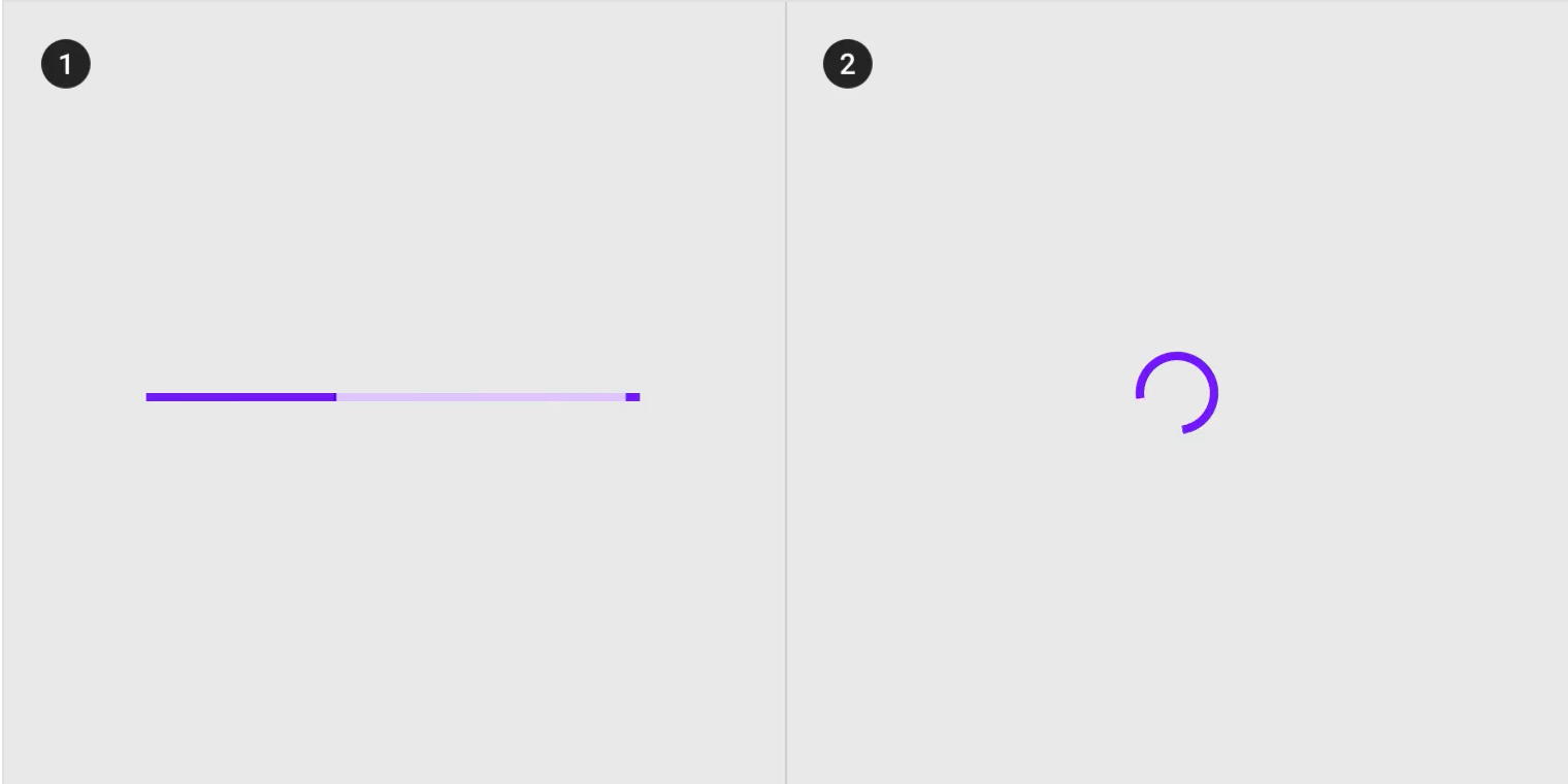
3) Progress indicator (current system status)
This form of feedback tells the user the current status of the system. If the user performs an action, it also reflects the state of processing their user input and expects a delay if applicable.

A non-action example would be the iPhone storage screen showing the current status of the storage “16.2 GB of 64 GB used”. If the user deleted many podcasts, the status would need to spend some time recalculating the current status. It might show a progress indicator, reflecting the user’s action of deleting podcasts to free up storage.

Progress indicators can be either “determinate” (specified finite wait time) and “indeterminate” (unspecified wait time) and illustrated using either (1) linear loaders and (2) circular loaders (both with unique design patterns).
4) Success and error
This form of feedback tells the user if their input was valid (successful) or invalid (unsuccessful). In the credit card input example, the field would return a success state if the card number was valid and an error state if the number was invalid.

The modal below is an example of a bad error state because it’s unclear what caused the error and doesn’t tell the user how to fix it.

All error states should come with a clear error message explaining the error and giving the user instructions on how to fix the mistake. In general, these error messages should be “in-line” (in context, underneath the component) rather than “global” (i.e., list of errors in a banner).
Real world example: elevators
In the real world, the principle of feedback is everywhere; it helps us make better decisions and avoid frustration and uncertainty.

Let’s consider the experience of using an elevator. When you press the “up” or “down” button, you’re telling the system your goal and expect the button to light up (acknowledgment of input).

When you look at the LED panel, you expect to see the current floor the elevator is on (progress indicator). The panel would also indicate an appropriate “out of service” status message when the elevator is broken.

We often take “feedback” for granted, so let’s consider the experience without these affordances. Imagine an elevator with one button and no LED panel. You’d press a button (which doesn’t light up) and hope an elevator might come (within an undetermined amount of time).
In this experience, we wouldn’t know if the elevator registered our button press (since it didn’t light up), we wouldn’t know how long to wait (since there’s no panel), if the elevator is working (since there’s no status indicator), and whether or not it’d be better to take the stairs (what floor it’s on & if it’s in service or not).
Closing thoughts
Most of us interact with systems on autopilot and don’t notice these subtle feedback cues that help us with decision-making and instill confidence in our actions. Next time you design something, make sure you’ve created your experience with appropriate and immediate feedback in mind.
Don’t forget to subscribe to get all the updates!
These emails might end up in your spam or promotions tab. To fix this, drag the emails back to the inbox or add ambitiousdesigner@substack.com to your contact list or send a reply.

If you found this useful, please consider sharing it with a friend or on social media. It’ll motivate me to write more and keep this going!
Another great one Richard, i share these articles of your on my twitter looks like you're not there otherwise would have tagged you, and not just that the place i work at our VP of design also share your articles with the team. Great work.
Thanks for another great post!
I do find myself on autopilot and ignoring these feedback messages (unless they've got some really quirky or funny copy).
Your designs are your way to converse with your users. Just like in real life you would like to acknowledge what others are saying or doing; you want to do that using your designs so users feel confident.