From Overwhelming to Intuitive: Effective Data Table Design
Designing the four goals of data tables: a comprehensive guide
Introduction
Data tables are the backbone of any effective user interface, providing a powerful tool to present complex and multifaceted datasets in a compact and digestible format. But despite their importance, designing a data table is more complex than you’d think. It may seem like a simple task, but there are countless tiny details that often go unnoticed and can make the difference between a user-friendly, intuitive table and one that’s confusing and frustrating. In this post, we’ll dive deep into the best practices for designing data tables, exploring the key considerations and insights that can elevate your designs to the next level. With the knowledge you’ll gain here, you’ll be able to create data tables that look great and provide a seamless user experience.
What is a table and what is it used for
A data table is a UI component that presents data in a grid format, where columns represent the different fields of the data, and rows represent the records. They are commonly used in business and financial applications, data-rich websites, and software with complex data structures.
Data tables are not suitable for every type of data presentation. They can be overwhelming and confusing when the number of columns and rows is too high, or when the data has a complex hierarchy. In general, when working with smaller amounts of data, or fewer records, it’s more beneficial to use cards instead.
A well-designed data table provides clarity on the information presented and helps users achieve their goals. There are four common goals associated with data tables: 1) find records that fit specific criteria, 2) compare data, 3) edit a single row’s data, and 4) perform bulk actions on multiple records at the same time.
Note: this article is an expansion of nnGroup’s ‘data tables’ article.
1) Find records that fit specific criteria
Users often have different objectives and approaches when it comes to searching for specific information in a data table. There are three scenarios to consider here; scenario 1: the user knows the exact name or details of what they are looking for and will use the search function. Scenario 2: the user is looking for several records that match specific criteria, and therefore might use filtering or sorting options to narrow down their search results. Scenario 3: the user is unsure about what they’re looking for and will just scan the table to find the information they need.
Designing a data table that can support these three scenarios involves several important details. First, the first column of the table should clearly identify each record with a human-readable identifier, as this makes it easier for users to search for a specific record. Imagine staring at an empty search bar trying to remember the 16-digit project ID.
Second, the columns should be ordered in a way that reflects the importance of the data to the user, with related columns placed next to each other to reduce the need for users to move their gaze between distant columns.
Last of all, when there’s a lot of data, there needs to be some form of filtering and sorting. Filter and sort are two common operations that are used to manipulate data in a table. The main difference between the two is the purpose they serve and the way they affect the data. Both filters and sorting can be applied together to achieve a more refined view of the data.

Filtering is a feature that allows users to reduce the amount of data displayed by specifying certain criteria. When a filter is applied, only the rows that meet the specified criteria are displayed, while the rest of the data is hidden. For example, if you have a table of patient information, you might want to filter out all records that aren’t ‘male’ and ‘less than 50 percent in treatment progress’. In general, filters should be ‘global’ meaning they should exist somewhere outside of the table and allow the user to apply multiple filters at once. It’s also important to have a clear active and inactive state for filters, so users understand when the filter is active.
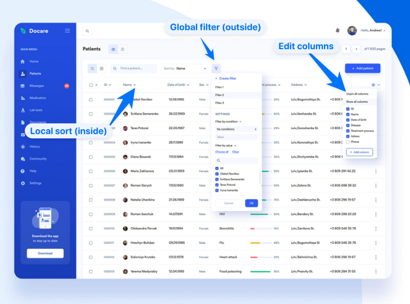
Sort, on the other hand, changes the order in which the data is displayed in the table without reducing the amount of data displayed. Sorting is applied to a single column and can be sorted in ascending or descending order based on the values in the selected column. For example, if you have a table of patient information, you might want to sort it by descending order for the ‘most recent visit’ column. Therefore, sorts should be ‘local’ and embedded within the headers of each column.
2) Compare data
Comparing data helps users detect relationships between different variables, find outliers, and generate insights. However, when dealing with large, complex data tables, users often encounter two common issues: 1) locating relevant information, and 2) making information adjacent for comparison. Therefore, as designers, we should make it easier for users to locate relevant information and make it easier to bring data points of interest close together for comparison.
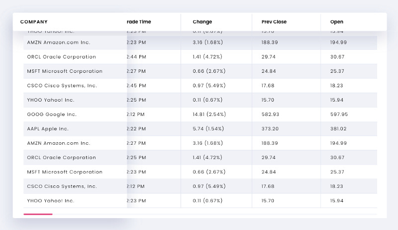
To address the first issue of ‘locating relevant information’, large data tables should 1) give users the power to pin certain rows and header columns, and 2) create visual anchor points for scanning and comparison. Pinning in the context of a data table refers to locking the position of the header or row in place while the rest of the table scrolls. Pinning a column or row allows users to position two records or columns next to each other, even if the original header or column would otherwise be hidden after scrolling.
This reduces the mental interaction costs of comparison by limiting the amount of eye movement and working memory load. In the example above, the subtle use of a drop shadow on the first pinned column looks like it’s floating “above” the rest of the table’s data to assist with spatial orientation and reinforce the horizontal scrolling affordance.
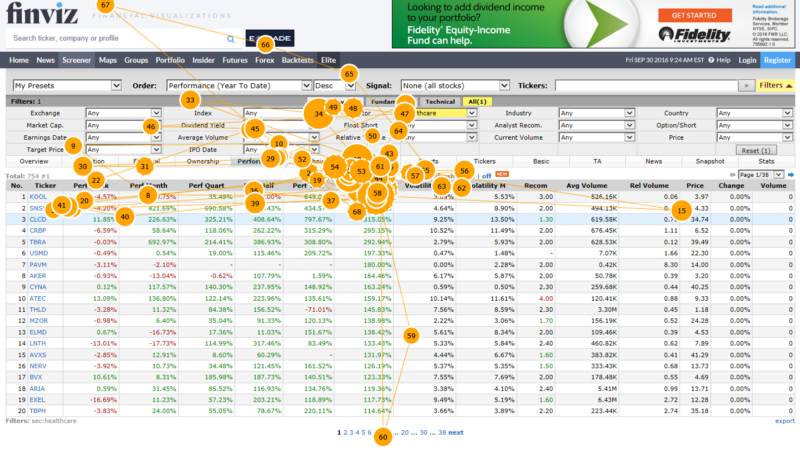
In terms of visual anchor points, it’s important to use light horizontal borders between each row. For denser tables with smaller row heights, the best practice is to use alternating background fills or ‘zebra stripes’. One last thing to consider is that most tables with checkboxes on each row have a hover state to indicate interactivity.
However, even when building a table without checkboxes, it’s still important to have ‘hover-triggered highlighting’ for each row. This is based on a proven reading technique called ‘finger-reading’, where the reader uses their finger (or a pen) to track the lines of text. Our eyes do not follow the flow of the text naturally; we default to ‘saccades’ when reading. Think of it as our eyes rapidly ‘jumping’ from word to word. However, with a visual anchor, our eye movements shift towards ‘smooth pursuit’ which is less erratic and better for focus and comprehension.

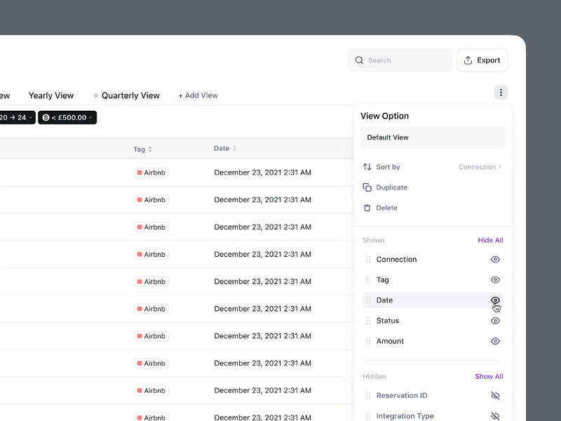
To address the second issue of ‘making information adjacent for comparison’, it’s important to build features that allow users to hide and reorder columns. In the example below, this feature is exposed using a dropdown modal with all the table columns in order. Each column has a toggle switch to show and hide that column, as well as a ‘drag handle’ icon allowing users to drag to rearrange the order.
3) Editing a single record
Editing a single record (row)’s data has historically been a challenge for complex or dense data tables. There are a number of design patterns suitable for this user task.
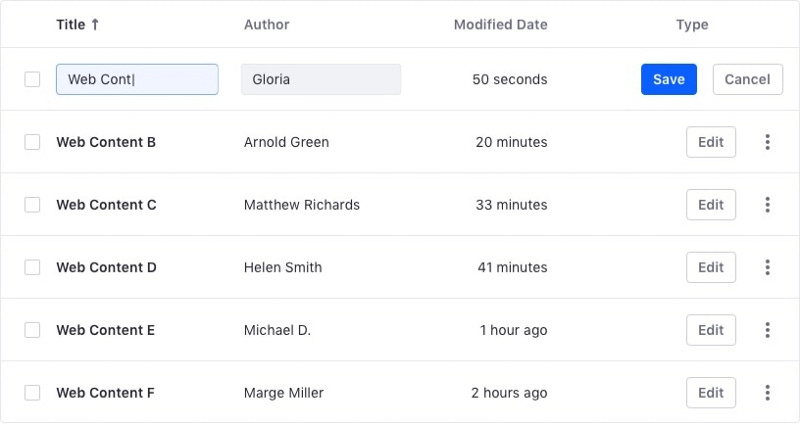
The first pattern is ‘edit in place’, the user clicks the ‘edit’ button on a row to change it from ‘read’ mode to ‘write mode’. This pattern works best if the table is narrow with no horizontal scrolling required to view the entire record. It’s important to note that all records should not be editable by default (i.e., a spreadsheet); otherwise, it’d be easy for users to accidentally make unintended edits.
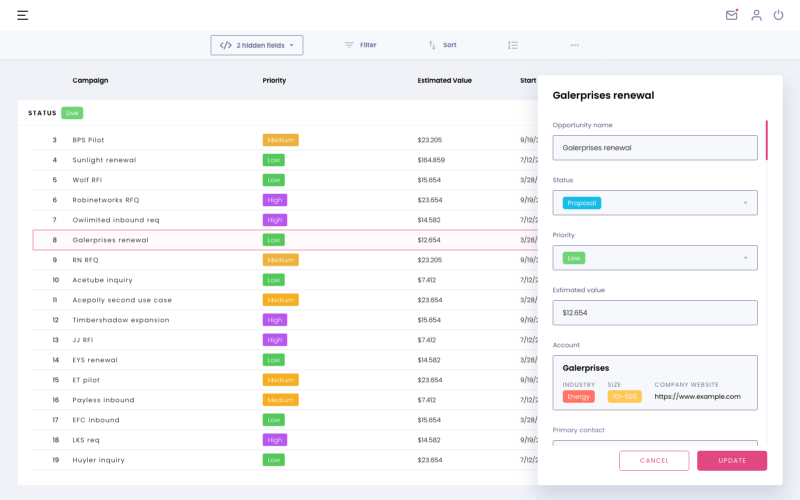
The second pattern is ‘contextual overlay’, which includes ‘modal editing’ and ‘side panel editing’. This pattern is more common for dense data tables with many columns (input fields). Modal editing opens a pop-up on top of the data table with all the record fields editable in a form. This pattern is generally not recommended as users typically reference and copy data from similar records rather than editing from scratch (as this helps them with recognition over recall). The alternative ‘side panel editing’ opens a side panel with the editable fields. Ideally, the side panel should ‘push’ the table and ‘squish’ it instead of opening it as an overlay.
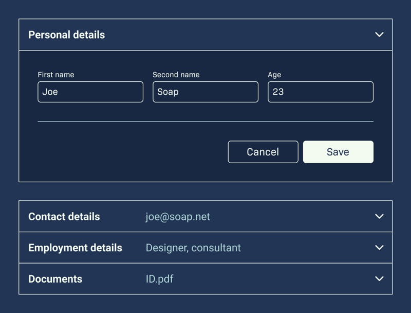
The last pattern is ‘accordion expansion’, where the user can expand the row to expose the editable fields. However, this could be potentially confusing to see duplicate labels. However, this is probably one of the best patterns for use cases where users typically edit a very small number of rows. A downside to this pattern is that users tend to not clean up after themselves (close accordions when they’re done with them) and may end up with cluttered displays unsuited for other core table tasks. More importantly, users will have difficulty referring to records that are not in immediate proximity to the one being edited.
4) Bulk actions
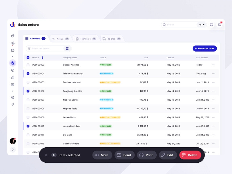
Bulk (or batch) actions refer to the mechanism of selecting multiple records (rows) and then performing a command or action on all of them. Bulk actions usually refer to ‘deleting’, ‘moving’, or performing specific tasks (e.g. e-mail, edit permissions, etc.) for the selected records rather than editing (although there are some scenarios where bulk editing makes sense). In most cases, the multi-record selection is done using checkboxes in the first column. For larger datasets, users will often filter the data before using the header checkbox to ‘select’ all the filtered rows.
After selecting at least two records, a contextual ‘bulk action bar’ appears. This contextual bulk action bar can replace the column headers (to save vertical space), appear above or below the column headers, or float in front of the table.

List of miscellaneous tips
So far we’ve covered the four most common user goals associated with data tables and their best practices and nuances. However, there are still a ton of micro-tips that are more straightforward that I’ll list below:
1. Use legible font families (avoid decorative or serif font families)
2. Create separation using spacing, alignment, and lines
3. All text in each row cell and header should be left aligned
4. Use vertical lines for each cell in a row when there are a lot of columns or similar content in adjacent cells (i.e., a text field next to a text field)
5. Use fixed headers (that remain in place when the user scrolls) for data tables with lots of columns
6. Use bold or all-caps text for column headers for contrast
7. Use contrasting colors for links so users know what content is clickable
8. An HTML element <caption> should be placed after the opening table element provides context for screen readers.
9. Avoid duplicating prefixes and suffixes in each cell; add the prefix or suffix in the header instead
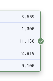
10. Right-align numeric columns; unlike text, numerical values are much easier to compare and contrast when right-aligned according to the position of the decimal
Ready to level up your design skills and reach your full potential? Subscribe to “The Ambitious Designer” newsletter for weekly doses of product thinking, design concepts & frameworks, and career insights.
I also have a Youtube channel helping designers with career coaching and interview prep. If you’d like to schedule a 1–1 coaching session with me, you can book an appointment.


