Unlocking the Power of Design Tokens to Create Dark Mode UI
Learn how to create multi-themed products using the three-tiered design tokens.
The rise of dark mode
Have you noticed that almost every product now supports dark mode? Dark mode refers to a user interface ‘theme’ that uses a dark color scheme instead of a light one. From social media to complex enterprise software, modern users now expect dark modes to be supported in all their digital experiences. To back this up with some numbers, around 82 percent of users prefer dark mode, and 64 percent expect the experience to auto-adjust to dark mode based on user preferences or time.

In the past, most products (websites) had a single (light) theme, which was fine because most users interacted with software within a stable desktop environment. However, modern users are now using their devices in darkened airplanes, in movie theaters, or in bed at night where light mode is less suitable. In these conditions, dark mode is helpful as it reduces the luminance emitted by device screens (making it easier to see in dim lighting and less distracting for others), while still meeting minimum color contrast ratios.
While implementing dark mode may seem like a simple task, there are several important factors to consider. In this article, you will learn how to implement dark mode on top of an existing design system with three-tiered design tokens.
Atomic design and design tokens
To create a consistent and flexible dark mode theme for your interface, it’s important to understand the principles of atomic design in design systems, design tokens, and how to create a multi-brand design system.
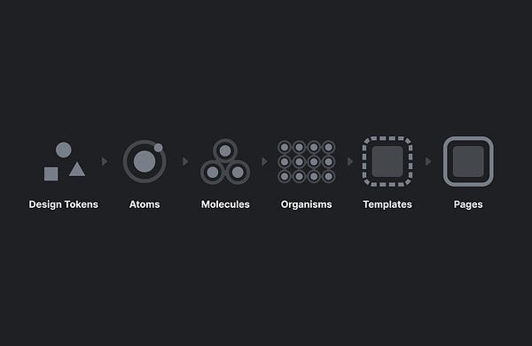
Let’s start by explaining ‘Atomic Design’, a framework invented by Brad Frost for developing scalable design systems. It’s based on the idea that a product’s design can be broken down into smaller, reusable components called atoms which can be combined to form more complex components, such as molecules and organisms, and ultimately entire templates and pages.

In 2014, Salesforce designer Jina Anne introduced the concept of a ‘design token’ which Brad Frost later integrated into the atomic design system. Design tokens are “smaller than atoms”, and are commonly used to define various attributes such as color, text, fonts, spacing, elevation, animation, corner radius, and more. These tokens ‘variables’ are defined in a central place for both designers (Figma’s style panel) and developers (in CSS) and kept at parity. These tokens can then be used to style components (atoms to organisms) within the design system.

To extend your design system to support multiple themes and brands, it’s important to understand how to leverage the three tiers of design tokens.
Tier 1 tokens (also known as ‘global’ or ‘reference’ tokens): T1 tokens are context agnostic and aren’t tied to a specific use case. Instead, they can be used globally or referenced by T2 tokens. When building multiple themes or brands, all tokens should exist at a T1 level. Example:
$blue-400.Tier 2 (also known as ‘semantic’, ‘alias’, or ‘decision’ tokens): T2 tokens map to T1 tokens and have design intent and relate to a specific context, i.e., product theme, light mode or dark mode, or brand. Example:
mainBackgroundColor: $blue-400Tier 3 (also known as ‘component-specific’ tokens): T3 tokens map to T2 tokens and define all variables and values for a particular component. T3 tokens are often used when developers need to override specific values in predefined UI components. Example:
mainButtonBackgroundColor: mainBackgroundColor

When implementing components, developers should reference the most specific token whenever possible (i.e., use a T3 token if it exists, even if the T1 token has the same value). This is important because if we wanted to change the color of a specific class of buttons across the product without impacting the other components we could just change the specific T3 token. However, if we referenced a T1 token, then all T2, and T3 components referencing that T1 would change.
Naming design tokens
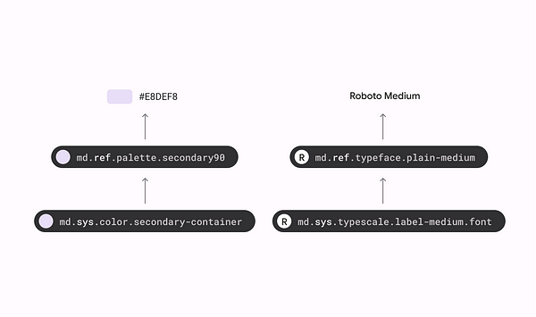
I won’t go into too much detail about design tokens. But with the three-tiered structure, it’s important to have a conversation with your team on a naming structure that makes sense. There’s an excellent guide written by Lukas Oppermann on naming design tokens here.
UI themes with T2 tokens
The three-tiered token architecture allows us to control a product’s theme (or brand) at the T2 level without impacting the core components. Converting components to dark mode becomes much simpler if all we need to do is create sets of T2 tokens that control the T3 tokens for each component in a different theme.
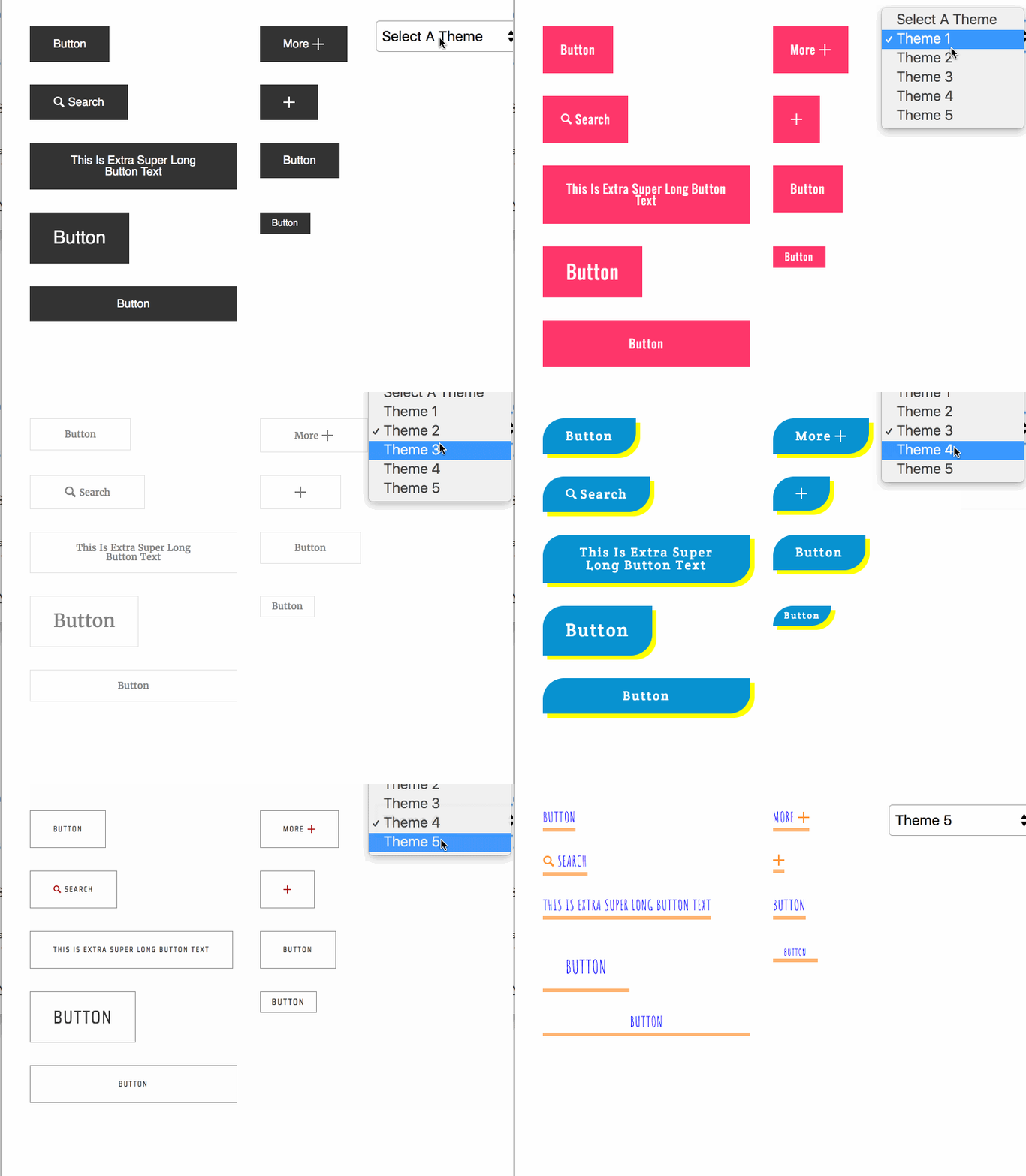
In the diagram below, the ‘blueprint brand’ button represents the base component with default design tokens. Brands A, B, C, and D all have their own set of T2 tokens. When we switch between brands (or light mode and dark mode) all we’re doing is swapping out the T2 token set which then updates all the T3 tokens to match the T2 theme

Lightmode to darkmode conversion
Technical details aside, converting your product theme from light mode to dark mode is more complicated than you’d think. It isn’t as simple as just inverting the colors; there are many aspects to consider such as elevation, color choices, contrast, and accessibility.
Elevation
In modern interfaces, design systems use ‘elevation’ levels to communicate a sense of depth and visual hierarchy. Elements in the foreground (closer to the user) stand out more than elements in the background.
Elevation in light mode is represented using shadows; however, in dark mode, shadows aren’t as visible. Instead, we use ‘surface illumination’; the lighter a surface’s elevation the closer it is to the ‘light source’, and thus the lighter the surface is.
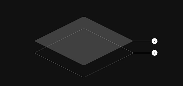
Lightness is often expressed through the use of a semi-transparent layer on top of the component’s surface (background). When creating elevation levels, it's best to have no more than 4–5 as more levels create potential accessibility and contrast issues.
True black vs. neutrals
It’s also important to call out that dark mode themes use a range of dark grays rather than true black (000000). Dark gray surfaces express a wider range of colors, elevation, and depth (and allow us to see drop shadows better if we choose to use them).

In addition, dark gray surfaces also reduce eye strain (especially in low-light environments), as light text on a dark gray surface has less contrast than light text on a black surface. Contrary to popular belief, too much contrast can be a bad thing.

The only scenario where you might want to use true black (and maybe borders instead of elevation) is if OLED battery power saving is a concern. Devices with OLED screens benefit from the ability to turn off black pixels to display true black, which consumes less power than displaying white or bright colors.
Studies have shown that dark mode can save around 40 percent of battery power on phones and tablets with OLED screens. Unfortunately, there is no noticeable impact on non-OLED screens.
Colors in dark mode
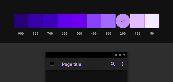
When adapting colors for a dark mode theme, it’s important to avoid using saturated colors. On dark surfaces, saturated colors won’t pass WCAG’s accessibility standard of at least 4.5:1 for readable text. Saturated colors also produce optical vibrations against dark surfaces and create visual strain for the user. Instead, opt for desaturated colors as a more legible alternative.
I’ve written an advanced article on the HSB (hue, saturation, brightness) color model if you’d like to try to create your own dark mode palette. But it’s easier to use Figma plugins like ‘Supa Palette’ that can auto-calculate the color values for a palette in both light and dark modes.
Conclusion
In conclusion, as technology continues to evolve, so do user expectations and needs. In this article, we covered several important factors to consider when implementing dark modes, such as atomic design and design token architecture, and the nuances between light and dark themes. Supporting dark mode in your design system is no longer just a nice-to-have feature, but a necessary consideration for your users who interact with their devices in various settings. So, whether your users are in a dimly lit bar or a brightly lit park, rest assured that your design system has got them covered.


